Friday, August 5, 2011

So now we have a family room....

One of my biggest beefs with our house is that we don't have a proper family room-- we still have the 1930's floor plan, and in those days big, open kitchens with media/lounge space adjacent were apparently not standard.  We did have a completely useless little pass-through room off of our main living area that began life as The Fireplace Room, then suffered through not one, but two ( failed) attempts at becoming a library space last year. 


I had my lightbulb moment late one Sunday afternoon in a quick solo spin through the thrift store, when I saw a feather poking out of some ugly red upholstery.  A quick check under the cushions and a quick google on my phone told me I was looking at a $3K custom sofa in perfect condition.  Grand total: $35.  $75 worth of white canvas duck later and we had a small, poufy, oh, so comfy little sofa just dying to be lounged upon. 

Did anyone else love this home in Southern Living last year?  (I keep saying I hate what Southern Living has become, but then I see at least one fantastic room or whole house in every single issue.  Agree?) 

It struck me after reading this article that the rooms in my house DO NOT NEED TO BE STATIC. 

Fireworks flahsed.  Angels sang.  And a new design plan was born.

So what if there wasn't a designated "family room" in our house?  Why not rearrange and make one?  (I'm still trying to convince my husband that our master bedroom would make an even more awesome family room, but he remains unswayed.  Party pooper.) 

And so with that little slipcovered sofa that could in tow, I set out to make loveliness where there had before been-- well, you be the judge.  Less than loveliness, I suppose.  It's been a slow year of gathering, but we are nearly ready for our close-up.  More pictures to come!
All images via Pinterest

Thursday, August 4, 2011

Blast from the past

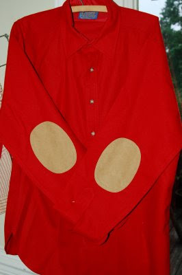
Remember this shirt?


He got a makeover.


I used this tutorial as a jumping off point-- I cut many, many circle-y shapes in a variety of sizes, and then starting with the largest, I kind of crimped them into tear-drop-shaped petals, sewing each petal on top of the next.  I fluffed and pulled them to make it look like a flower, then added a vintage ticking-stripe button to the middle.

It sounds hard, but don't worry, it wasn't.  I drank wine and watched TV while I sewed.  Emersonmade it is not, but I have my $78 and it's Melissamade, so even better. 

Tuesday, August 2, 2011

Amazing Art

One of the million reasons I love Greensboro is the Weatherspoon Art Museum on the campus of UNCG.  It's lovely, free, and filled with a fantastic permanant collection.  And when I took the kids last week to peek around, I found out exactly how I should spend that spare hundred grand I've got in a shoebox under my bed.


The work of Rackstraw Downes-- I could spend hours staring at each and every one.   

The computer screen doesn't do it justice-- in real life, these were breathtaking.  If you live in Greensboro, go!

Monday, August 1, 2011

Budget Makeover: boob light made beautiful

I take no credit for this brilliant idea-- it's all Stephanie over on Sabbespot--I am just a genius-moocher today.

Here is my boob light.  You probably have one of these somewhere, too, don't you?  The most unfortunate design of the 20th century, laminated chintz not withstanding.


(This is our new den, by the way, camera-phone style.  I think I'm going to talk about it more this week.)

Enter a large, linen-covered drum shade that I found at Goodwill for $3.99.  I think it came from Target-- it was still in the original plastic wrap.  (In case you don't frequent Goodwill, they often carry overstocks and damaged goods from Target at deep discounts.)  I unscrewed the boob-light cover, turned the shade upside down, and screwed the little metal finial from the original light back on.  It took less than 5 minutes, and now we have this:
So much better, right?!


Wednesday, July 27, 2011

Mid-week Pretties

Here are a few of the images I've pinned this week--I love looking back over my pins for the week to see what caught my eye.
I'm thinking dining room this week-- having a big soire here in a couple months and I am tired to death of what is in there right now. 
See any themes?

And wanna buy the "Champagne" art for me?
Go forth and pin and be happy everybody.


All image sources can be found on my Pinterest page.  The cabinet and the last image aren't pinned-- via here and here.

Tuesday, July 26, 2011

A Solution to my Chair Dilemma

Let me begin by pointing out that today I'm solving a DILEMMA, not a delima, as I did yesterday, which my husband so kindly pointed out via text while I braved the grocery store with two heat-hopped kids at noon to buy something which I would then sllllaaaaavvvve away at to turn into his dinner, hot on the table when he walked in the door that evening (22 minutes late.  But who is counting.)  I cannot spell, and he can, and there it is.

I like to think that what I lack in boring pursuits like spelling (and math facts and solving The Jumble) I make up for in sparkle.   

Moving on.


So I found this picture via My Notting Hill today, and I think the chairs from yesterdays post would look fab-u-lous slipped in cream with a charcoal grey stripe up the middle. 

Now if only I could buy time as easily as groceries.  Sigh.

Monday, July 25, 2011

Design Delima: What would you do?

So--  I've had many pairs of chairs in front of my fireplace/cabinet the last few years.  I've had enough of the serial chair-ing, and I'd really like to settle down with a good pair. 
Is this it?  They are beyond comfortable-- super little mid-century tub chairs I got for the cost of a Big Mac at a really scary thrift store in Winston-Salem. 

They are in need of new clothes, and I am so hesitant to bring anything but slipcovers into my house.  Which means either I pay someone a few hundred dollars for something I am not sure is right or I do it myself-- and I hate, hate covering curved backs.  It's hard.

What would you do?